The Design tab in your admin dashboard gives you full control over the look and feel of your Liinks page. Here's an overview of all the customization options available.
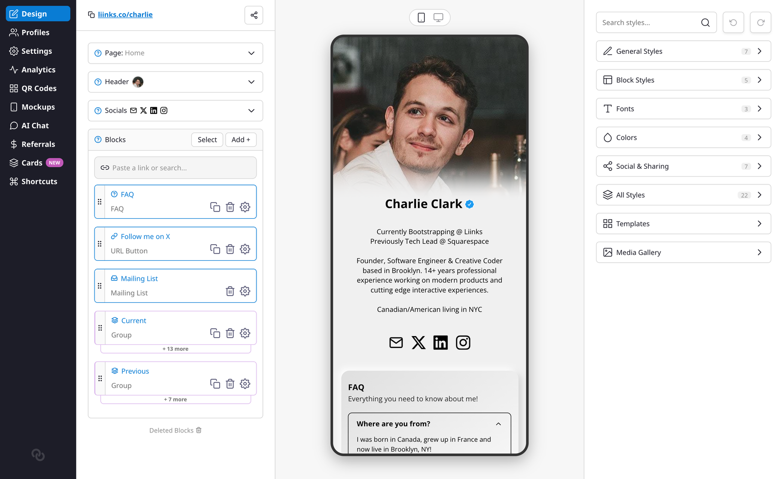
The right sidebar organizes settings into sections: General Styles, Block Styles, Fonts, Colors, Social & Sharing, All Styles, Templates, and Media Gallery. Header layout, background, and profile picture options are all found in General Styles.
To give you more room to design on desktop, the left navigation rail collapses to a slim strip of icons while you're on the Design tab. Hover over it to expand it back out and see the labels, then move your cursor away to tuck it back in. Nothing is hidden permanently: your dashboard navigation is always one hover away.
Header Layout
Choose how the top of your page looks with four layout options:
- Classic — Your profile picture, name, and bio displayed in a centered column. This is the default layout.
- Banner — A full-width colored sheet behind your profile section, giving your page a card-like header area.
- Business — A compact, professional header with a smaller profile picture alongside your name and a tagline. Great for brands and businesses.
- Headshot — A large, prominent profile photo that fills the header area.
When using Banner, Business, or Headshot, additional options appear:
- Sheet Color — The background color of the header sheet.
- Sheet Fade — Adds a smooth gradient fade at the bottom of the sheet, blending it into your page background.
- Header Text Color — Set the text color within the header area (Business layout only).
Background
Choose from several background types:
- Solid — A single background color.
- Gradient — A smooth transition between two colors.
- Split — Two distinct background colors split across the page.
- Image — Upload a custom background image with an optional overlay to adjust brightness.
- None — A transparent/white background.
You can also set a separate Desktop Background Color that only appears when your page is viewed on a larger screen.
Colors
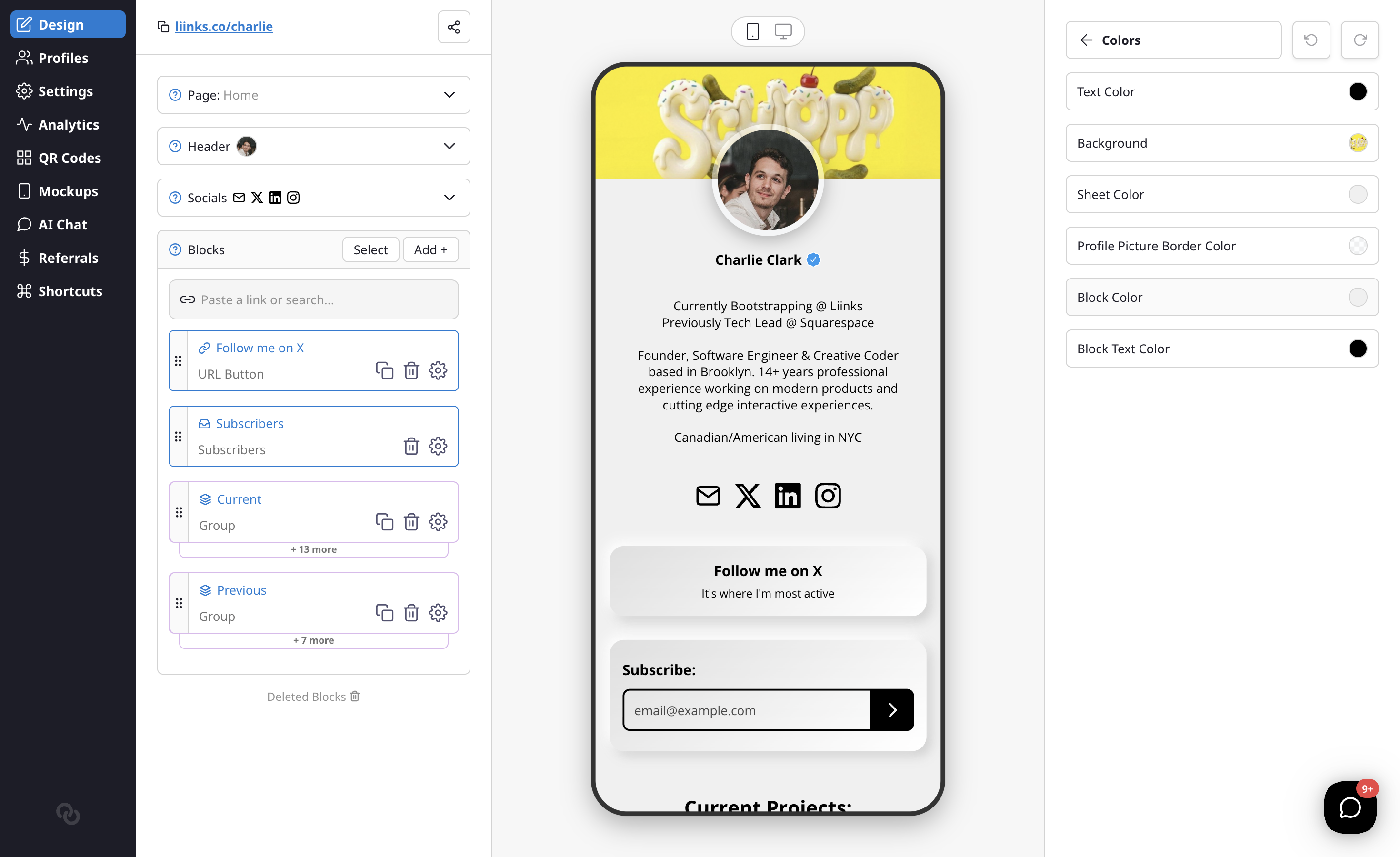
- Primary Text Color — The main text color for your page.
- Block Color — Background color of your blocks.
- Block Text Color — Text color within blocks.
- Label Color — Background color for link labels (if you use labels).
- Label Text Color — Text color for labels.
- Button Color — Color of call-to-action buttons on your links.
- Button Text Color — Text color within CTA buttons.
- Block Border Color — Border color around blocks.
Block Styles
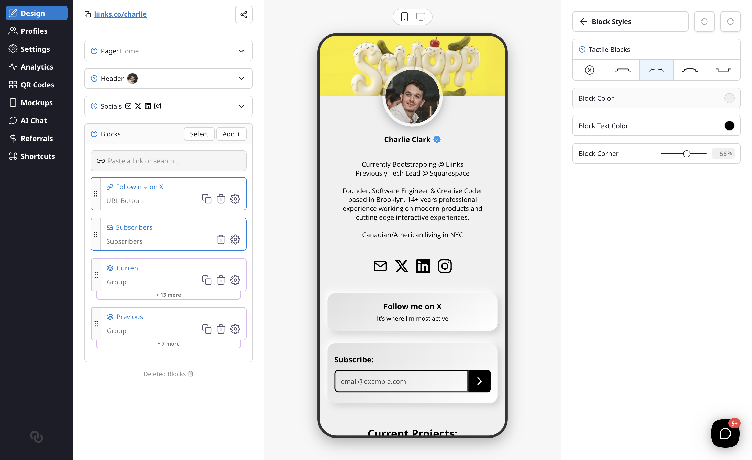
- Tactile Blocks — Choose a 3D effect for your blocks: Flat, Concave, Convex, or Inset. When enabled, the page background becomes the block color.
- Block Corner — Adjust the border radius from square to fully rounded.
- Block Border — Control the border width around your blocks.
- Block Shadow — Add a shadow effect to your blocks.
- Shadow Style — Choose between Soft (blurred) or Solid (hard edge) shadows. Appears when Block Shadow is turned up.
- Block Spacing — Adjust the gap between blocks on your page.
Fonts
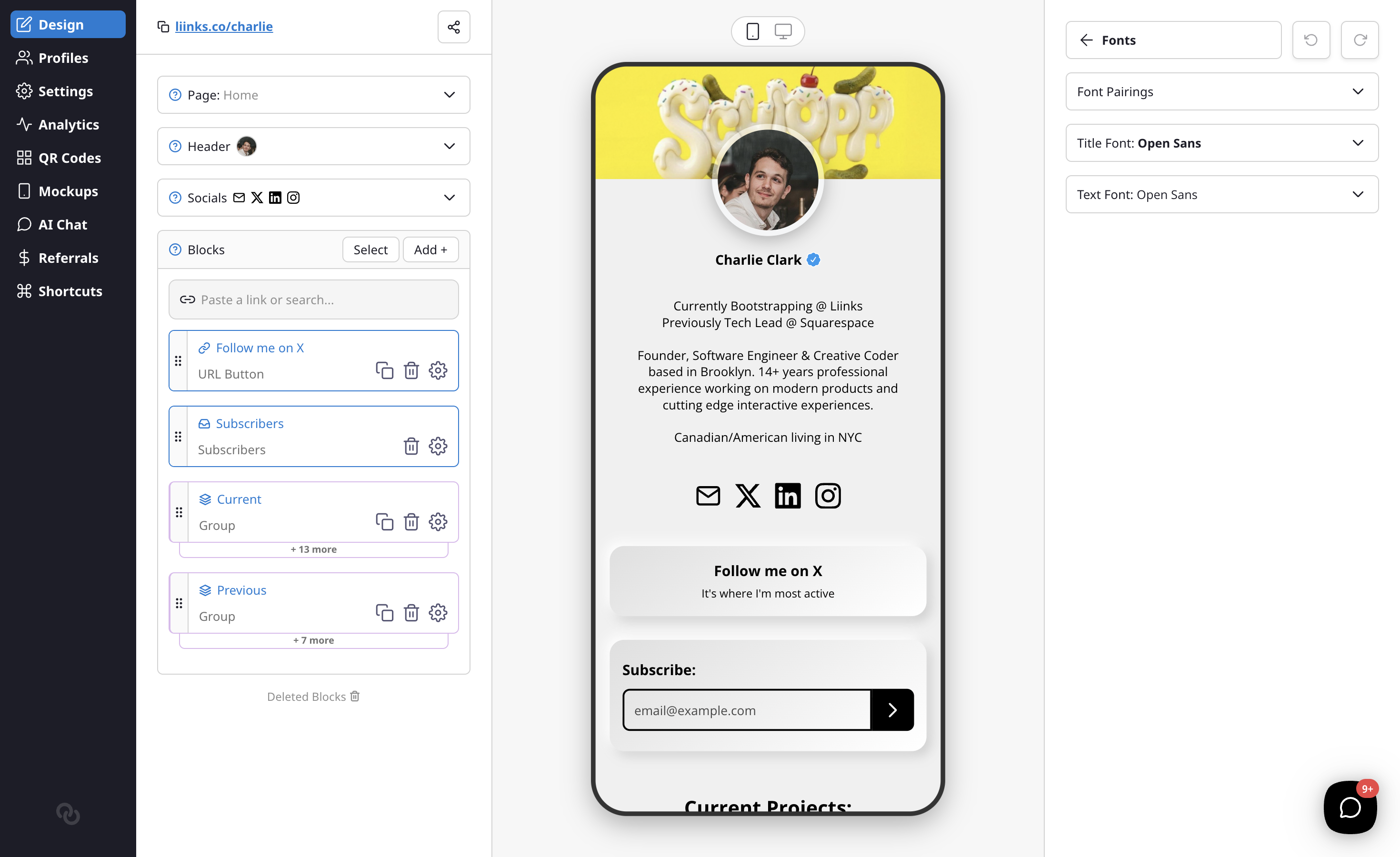
Customize your page typography with two font options:
- Title Font — Used for your profile name and headings.
- Text Font — Used for descriptions and body text.
Profile Picture
These options are found in General Styles, below the background and color settings.
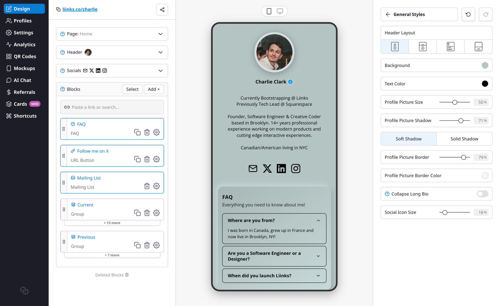
- Profile Picture Size — Adjust the size of your profile picture.
- Profile Picture Shadow — Add a shadow behind your profile picture.
- Shadow Style — Choose between Soft (blurred) or Solid (hard edge) shadows for your profile picture. Appears when Profile Picture Shadow is turned up.
- Profile Picture Border — Add a border around your profile picture.
- Profile Picture Border Color — Choose the border color.
- Collapse Long Bio — Limit your bio to 3 lines with a "show more" toggle.
- Social Icon Size — Adjust the size of social media icons.
Note: When using the Headshot header layout, Profile Picture Size controls the height of the header image instead of the profile picture itself. The Shadow and Border options are hidden in that layout.
Advanced Options
- Enable Add Contact — Show a vCard export icon so visitors can save your contact info.
- Enable Share Button — Add a share icon to your page.
- Enable Search — Let visitors search through your blocks.
- Show Page Tabs — If your profile has more than one page, display your pages as a row of tabs at the top of your profile so visitors can switch between them without opening the menu. The tabs appear as frosted-glass pills with the active page highlighted, and they scroll sideways when you have a lot of pages. The menu icon stays available too. This option only appears once you have at least two pages. See Add and manage multiple pages to set up additional pages.
- Click For QR Code — Clicking your profile picture shows your QR code.
- Hide Liinks Branding — Remove the Liinks footer. See Hide Liinks branding.
- Custom Logo — Upload a logo to display on your page with adjustable sizing.
- Verified Badge — Show your verification badge (if approved). See Verifying Your Profile.