Your page has global styles that control the default look of every block — colors, corners, fonts, and more. You can also override any style on a single block without changing the rest of your page.
Global styles
Global styles are set in the Design tab on the right side of your admin dashboard. Any change you make here applies to every block on your page at once.
Block Styles
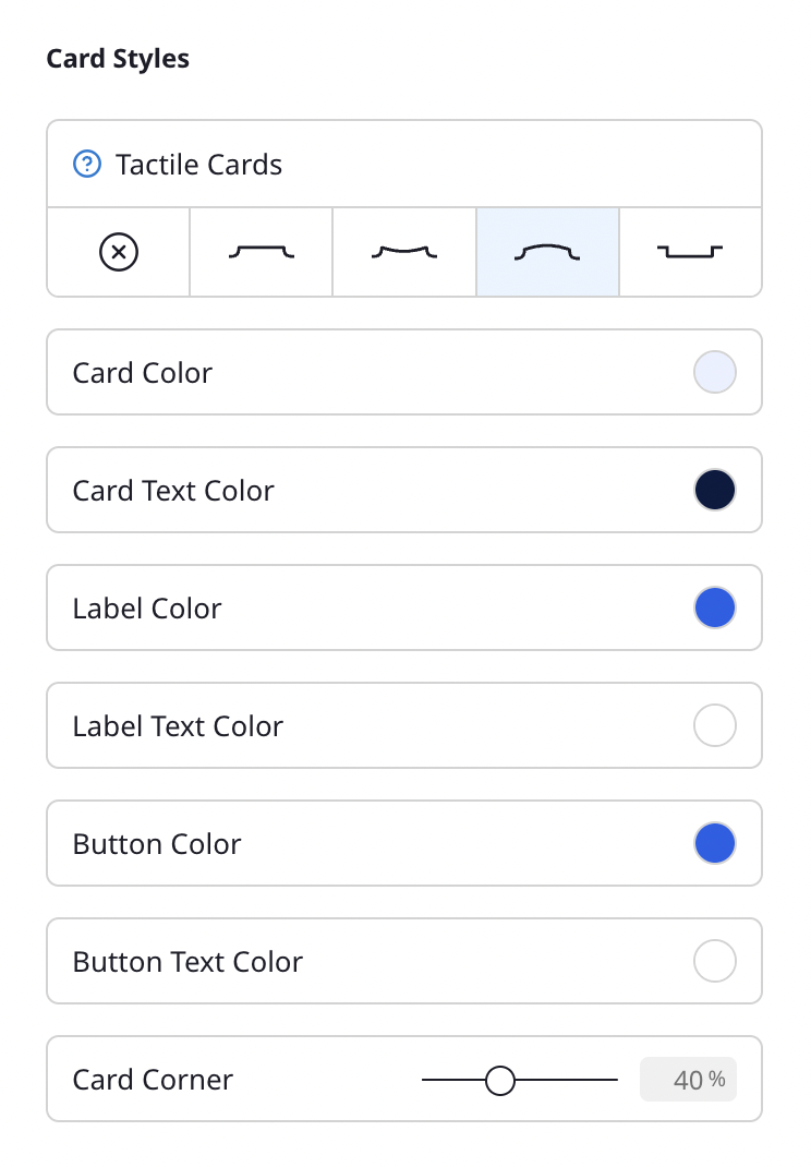
- Tactile Blocks — Give your blocks a physical, 3D look. Choose from Flat, Concave, Convex, or Inset effects. When Tactile Blocks is on, the block color is driven by your background color.
- Block Color — Background color of your blocks.
- Block Text Color — Text color within blocks.
- Label Color — Background color for labels on your blocks.
- Label Text Color — Text color for labels.
- Button Color — Color of call-to-action buttons.
- Button Text Color — Text color within CTA buttons.
- Block Corner — Adjust the corner radius from square to fully rounded.
Fonts
- Font Pairings — Choose from preset font combinations that pair a title font with a body font.
- Title Font — The font used for your profile name and block titles.
- Text Font — The font used for descriptions and body text.
For a full list of all design settings, see Design options.
Per-block custom styles
When editing a block, open the Styling section to override specific styles for that block only. Each style field has a lock icon next to it.
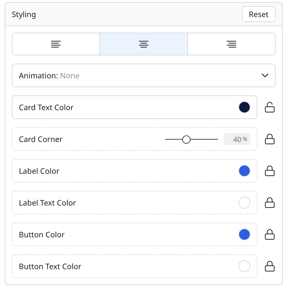
How the lock icon works
- Locked (dashed border) — The field uses your global style. Changes in the Design tab will automatically update this block.
- Unlocked (solid border) — The field has a custom value for this block only. Changes in the Design tab won't affect it.
Click the lock icon to toggle between global and custom:
- To customize a block: Click the lock icon to unlock the field. It will start with your current global value, which you can then change.
- To revert to global: Click the lock icon again to re-lock the field. The block will go back to using your global style.
Available per-block overrides
- Block Text Color
- Block Corner
- Label Color and Label Text Color
- Button Color and Button Text Color
- Animation (Shake, Pulse, Jump, Swing, and more)
Text alignment
Each block can also have its own text alignment — left, center, or right — independent of other blocks.
Tips
- Start with global styles first. Set up a color scheme and font pairing in the Design tab, then customize individual blocks only where needed.
- Use the Reset button in the Styling section to clear all per-block overrides at once and return to your global styles.