Form blocks let you create forms to collect information from your visitors, whether it's email sign-ups, feedback, applications, RSVPs, or any other data you need. Forms are available on all plans.
How to create a form
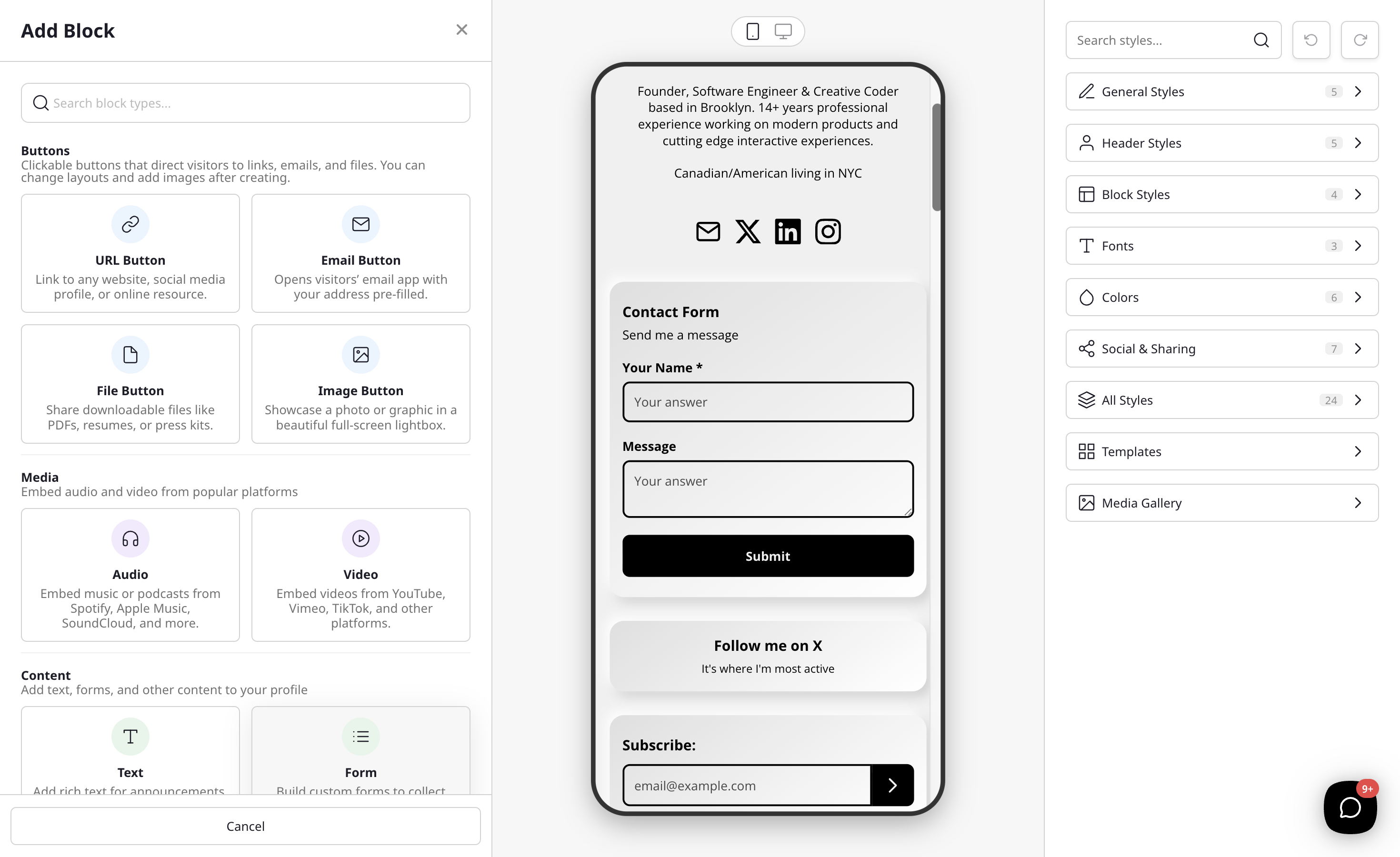
- Click the Add Block button on your profile editor.
- Select Form from the block type list. You can choose the general Form option (under Content) to start from scratch, or pick Collect Emails (under Engagement) to start with a ready-made email sign-up form.
- The form builder will open where you can configure your form.
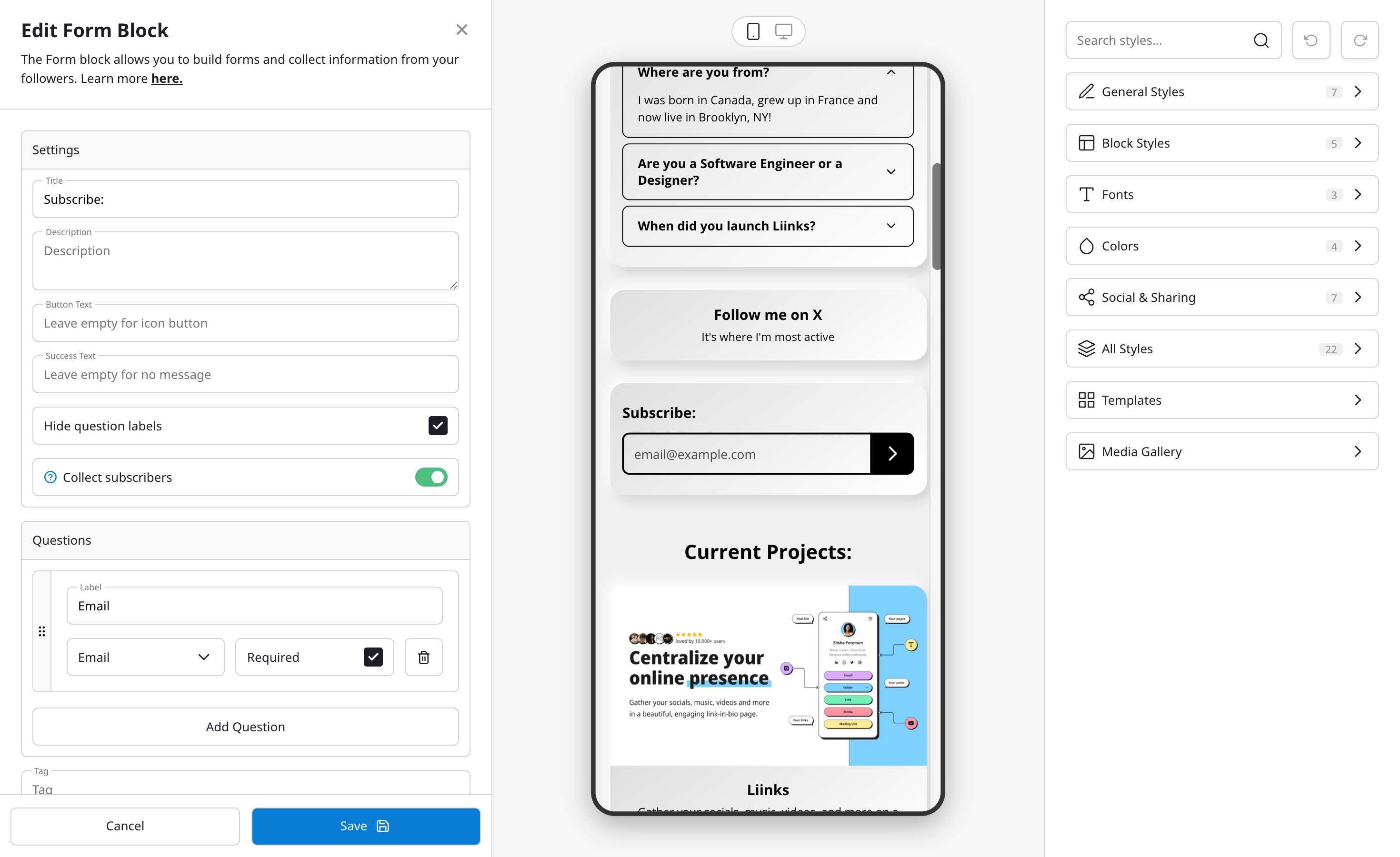
Form settings
- Title — The heading displayed at the top of your form.
- Description — Optional instructions or context for your visitors.
- Button Text — The text on the submit button (default: "Submit").
- Success Message — The message shown after a visitor submits the form (default: "Thank you!").
- Hide Labels — Toggle this on to hide field labels, showing only placeholder text inside each input. Useful for compact, single-field forms like email sign-ups.
Collecting subscribers
If your form includes an Email field, a Collect subscribers toggle appears in the form builder. When enabled, every email submitted through the form is automatically added to your subscriber list (viewable in Analytics > Subscribers).
This is the recommended way to collect email sign-ups on your page. The Collect Emails template in the Add Block modal creates a single-field email form with this toggle already enabled.
If you have Mailchimp connected, subscriber-mode submissions are synced to your Mailchimp list automatically. See Connecting to Mailchimp for setup instructions.
Field types
Each form can have multiple fields. The following types are available:
Text inputs
- Short Text — A single-line text input. Good for names or brief responses.
- Long Text — A multi-line text area. Good for comments, feedback, or detailed answers.
Validated inputs
- Email — A text field that validates email addresses.
- Phone — A text field for phone numbers.
- URL — A text field that validates web addresses.
- Number — A numeric input field.
Choice inputs
- Dropdown — A select menu with predefined options. Visitors pick one.
- Checkbox — A list of options where visitors can select multiple.
- Radio — A list of options where visitors pick exactly one.
For Dropdown, Checkbox, and Radio types, you provide the choices (minimum 2 options) when building your form.
Date and time
- Date — A date picker.
- Time — A time picker.
- Date & Time — A combined date and time picker.
Other
- Rating — A 5-star rating input.
Building your form
- Click Add Field to add new fields to your form.
- Set the label (what visitors will see).
- Choose the field type from the options above.
- Mark fields as required if they must be answered before submitting.
- Drag fields to reorder them.
- At least one field must be marked as required.
Viewing responses
Form responses are available in your Analytics panel:
- Go to the Analytics tab in your admin dashboard.
- Click on the Forms section.
- You'll see a list of your forms with response counts and the date of the last response.
- Click on a form to view all individual responses in a table format.
You can also export responses as CSV for use in spreadsheets or other tools.
Notifications
You'll receive a notification when someone submits a response to your form, so you can follow up promptly.